Intel Spur
In response to an opportunity to create the new name and brand identity for Intel’s upcoming event series, we created Intel Spur: equal parts mission and call to action. It inspires life-changing innovation, provokes progress, causes change. To borrow words from Intel’s recent rebranding formulative documents: Spur is the fuel for wonderful.
Creating Intel’s new flagship event brand in two weeks
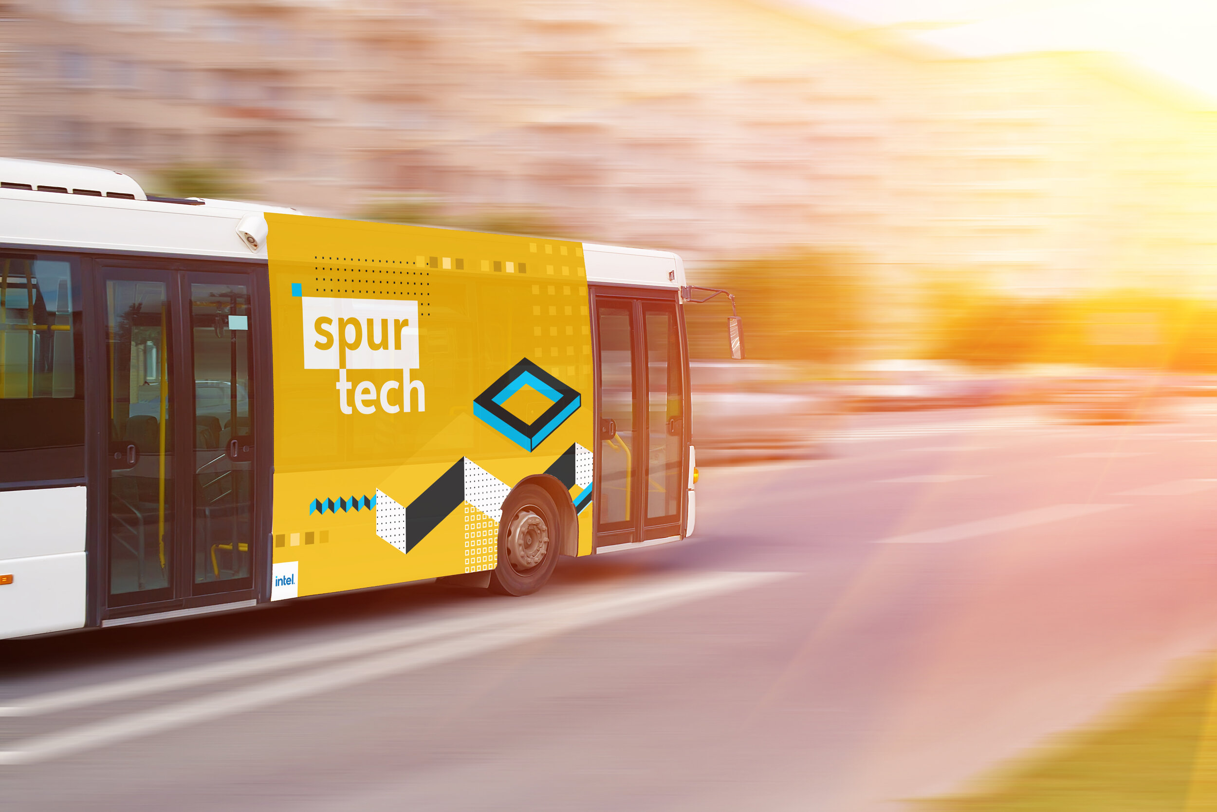
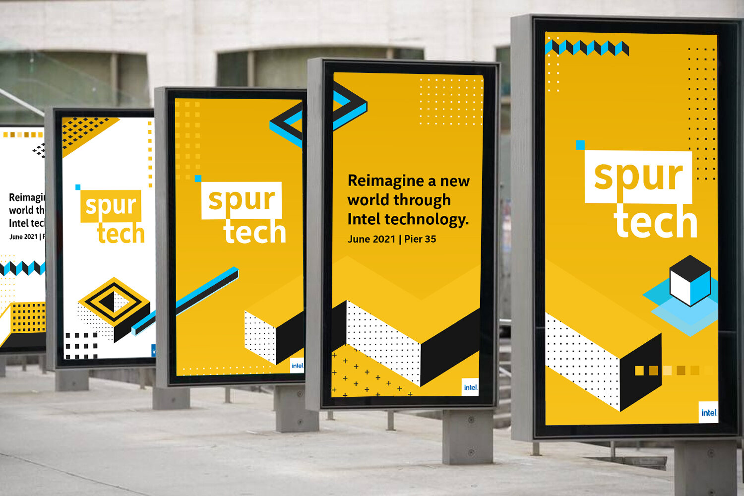
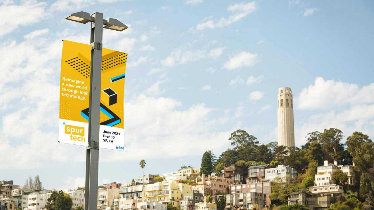
While contributing to the creation of the spur name, I simultaneously designed the entire event brand. The Spur logo serves as an extension of the new (summer 2020) Intel branding system and links the corporate logo to the broader event expression. The logo is designed for an adaptive application – with an overall event unifying logo, tier one event, and subsequent tier two (regional) applications.
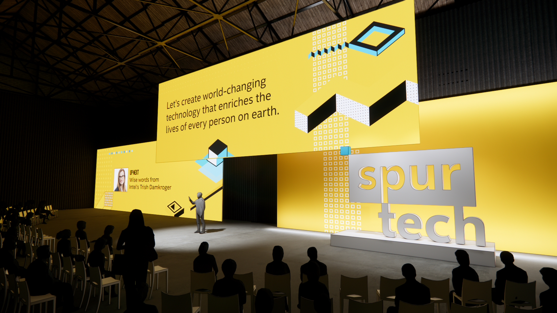
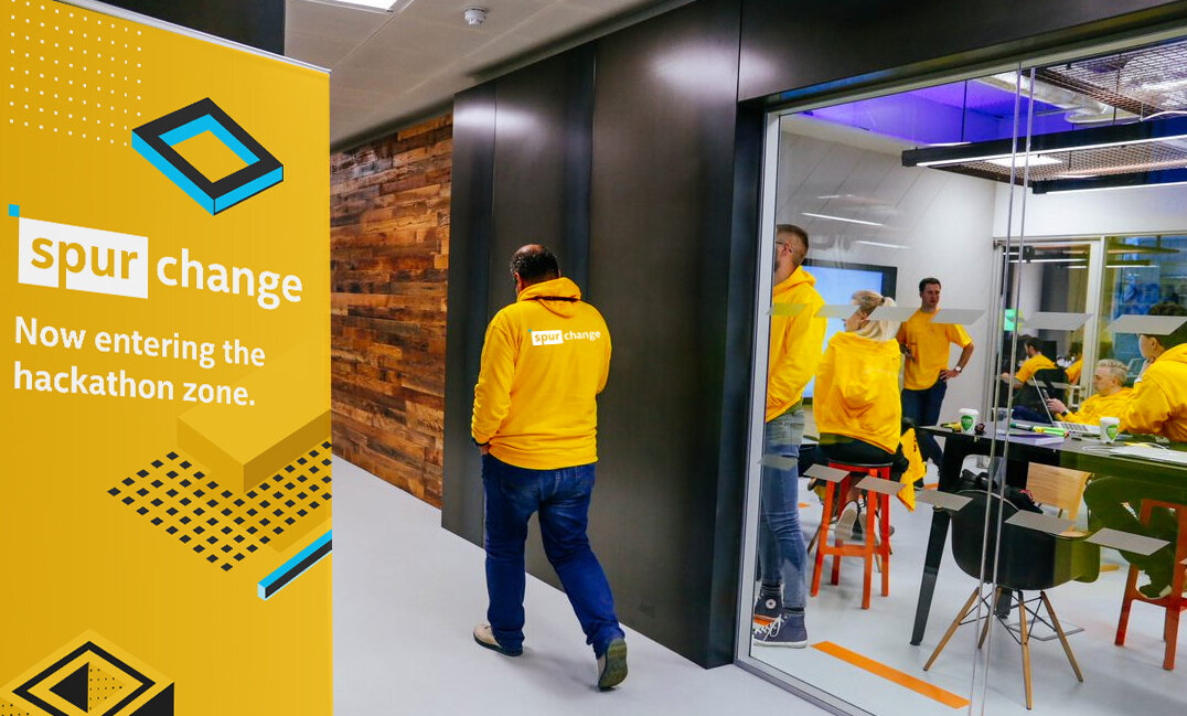
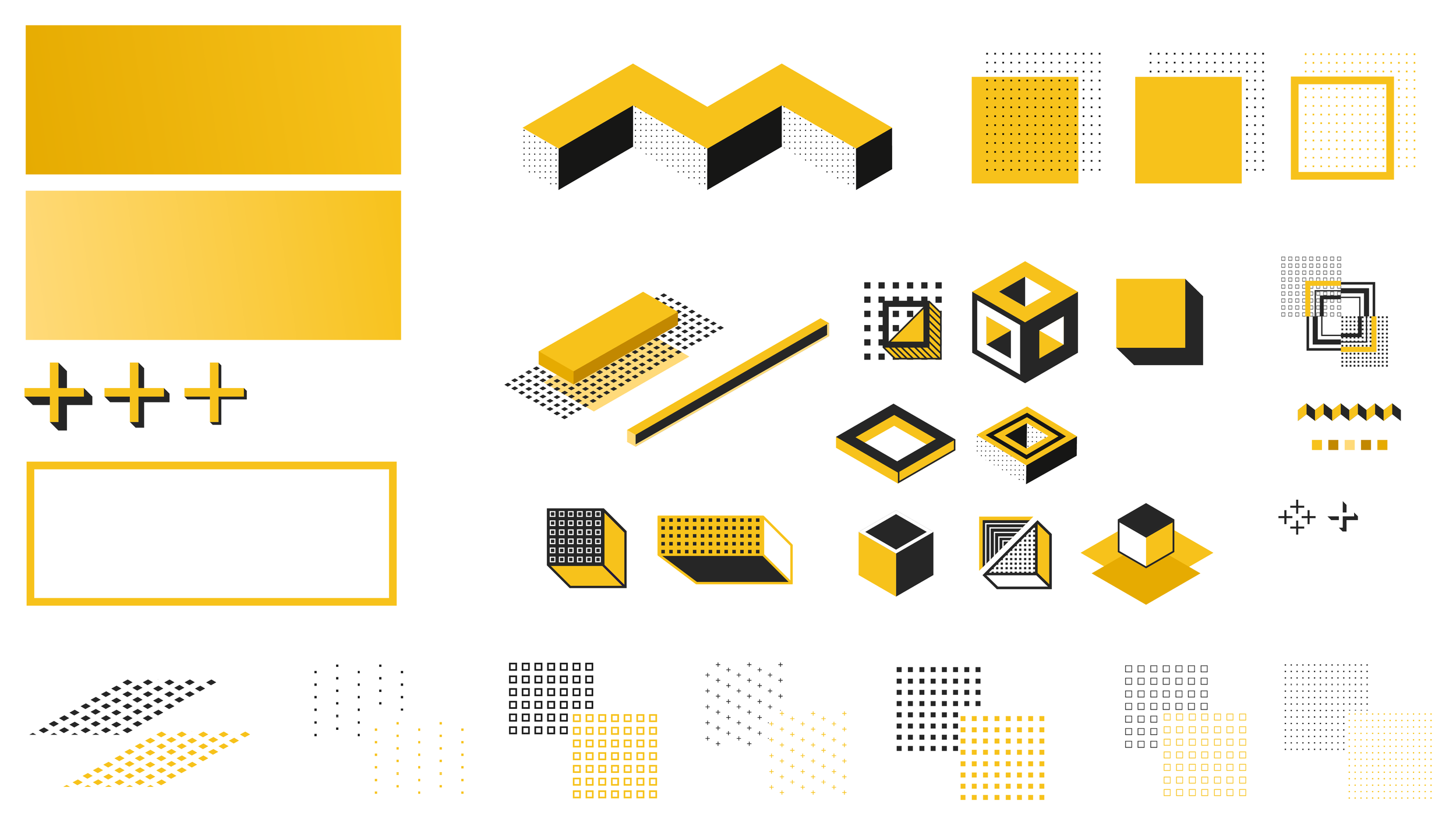
Spur's deceptively simple design is born of a collection of patterns, rectilinear interpretations of “The Spark” (a foundational Intel brand element) and dimensional extrusions. Weaving this mix together became the visual foundation for storytelling centered on individuals and communities, products and platforms, companies and solutions. The design is a workhorse, built to satisfy digital, environmental and content needs via modularity, movement, scalability, depth and simplicity.
The Spur system was fashioned with growth and flexibility at the forefront of the design. Over the next three to five years, each Tier One's unique texture and story is shaped and further defined.
Shapes: By highlighting specific components and adding new artifacts tied to products and technology.
Textures: Via movement, macro/micro applications and thoughtful, depth-revealing overlays and patterns.
Color: By toning up the relationship of Energy Blue, sifting in Carbon and utilizing tints and shades, we extend the combinations and possibilities.
Role: Creative Director, Brand Lead
Team:
Mick Brennan, Executive Creative Director, Copy Lead
Stephen Kellogg, Executive Creative Director, Project Oversight
Charlie Davis, Environmental Support
Andre Correa, Motion Design Support
Timeline: 2 weeks


